
Generate App Icons in Under a Minute
How to Generate Store-Ready iOS & Android App Icons (Without Figma or Photoshop). Here’s the fastest workflow:
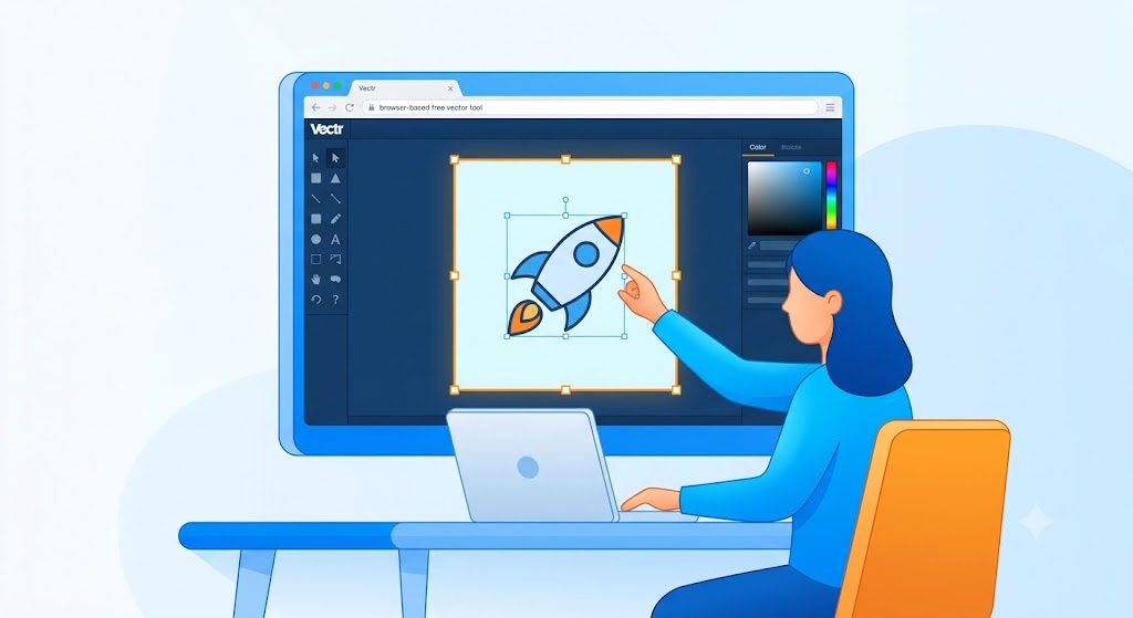
- Create a 1024 × 1024 pixel master icon using a free design tool such as Canva or Adobe Express.
- Keep your logo or graphic centered so it won’t be cropped by Apple’s rounded-square icon shape or Android’s adaptive icon masks.
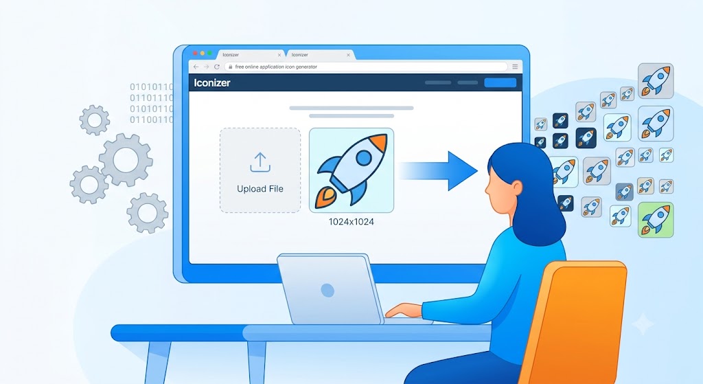
- Upload the image to a free icon generator like EasyAppIcon, AppIcon.co, or Swiftspeed.
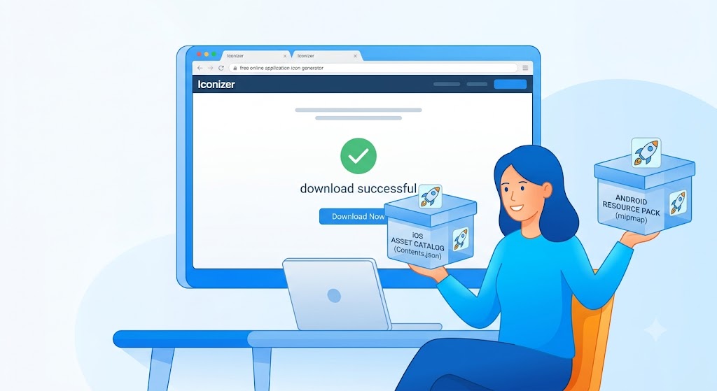
- Download the generated ZIP package.
- Import the files into Xcode or Android Studio.
The entire process usually takes less than five minutes and eliminates the hassle of manually creating dozens of icon sizes.
Why App Icons Matter More Than Most Developers Think
When people browse an app store, they make snap judgments.
Before they read your description, check screenshots, or watch a preview video, they see your icon.
A polished icon immediately signals professionalism. A blurry, crowded, or outdated icon can make even a well-built app feel unfinished.
I’ve worked with indie developers who spent months perfecting their apps but rushed through icon design at the last minute. The result wasn’t a rejected app—it was something worse: a product that looked less trustworthy than competing apps.
Your icon is your app’s first impression. It’s worth getting right.
Table of Contents
- What Makes a Good App Icon?
- The Simplest App Icon Workflow
- Phase 1: Design a Master Icon
- Phase 2: Generate Every Required Size Automatically
- iOS vs Android Requirements
- Deployment Checklist
- Common Mistakes to Avoid
- Real-World Example
- Professional Design Tips
- Frequently Asked Questions
- Final Takeaway
What Makes a Good App Icon?
Great app icons usually have three things in common:
- They’re simple.
- They’re recognizable at small sizes.
- They communicate the app’s purpose or brand instantly.
Think about the icons you see every day. Most aren’t complicated illustrations. They’re simple symbols, shapes, or logos that remain recognizable even when displayed at less than half an inch wide.
A good rule of thumb is this:
If someone can’t identify your icon at a glance, it’s probably too complicated.
The Simplest Workflow for Generating App Icons
Creating store-ready icons can be broken into two straightforward phases.
Phase 1: Create One High-Quality Master Design
Design a single icon at 1024 × 1024 pixels.
This becomes the source file for every size you’ll need later.
Phase 2: Let Software Generate Everything Else
Upload the master image to an icon generator.
The tool automatically creates:
- iOS icon sizes
- Android icon sizes
- App Store assets
- Play Store assets
- Folder structures
- Configuration files
Instead of exporting dozens of files manually, you’ll receive a complete package ready for development.
Phase 1: Designing the Master Icon
Use Canva or Adobe Express
Unless you’re creating highly detailed artwork, you probably don’t need professional design software.
For most projects, Canva and Adobe Express are more than enough.
Both tools allow you to:
- Create square canvases
- Export high-resolution PNG files
- Work directly in your browser
- Use templates, icons, and typography tools
For beginners, they’re significantly easier to learn than Photoshop.
Design Rule #1: Keep Critical Elements Centered
One of the most common mistakes is placing important content too close to the edges.
Your icon might look perfect in Canva but appear cropped once installed on a device.
This happens because both Apple and Android apply their own icon shapes.
Apple’s Rounded Square
Apple automatically masks icons into its signature rounded-square shape, often called a “squircle.”
Corners get trimmed.
Android’s Adaptive Masks
Android devices can display icons differently depending on the manufacturer.
Your icon may appear:
- Circular
- Rounded square
- Teardrop-shaped
- Squircle-shaped
An icon that looks great on one device may lose important details on another.
Safe Area Recommendation
Keep all essential elements inside the center 70–80% of the canvas.
This simple habit prevents most cropping issues.
Design Rule #2: iOS Icons Should Be Fully Opaque
This requirement surprises many first-time developers.
Apple expects app icons to be fully opaque.
That means:
- No transparent backgrounds
- No alpha transparency
- No partially transparent effects around edges
If you’re exporting a PNG, double-check the background before uploading it.
A solid background color is the safest option.
Design Rule #3: Understand Android Adaptive Icons
Android offers a more flexible icon system called Adaptive Icons.
Instead of using one flat image, Android can combine:
Foreground Layer
Contains:
- Logo
- Brand mark
- Main symbol
Background Layer
Contains:
- Color
- Gradient
- Pattern
The operating system dynamically combines these layers.
This allows icons to adapt gracefully across different device manufacturers and launchers.
For most beginner projects, a standard icon is perfectly acceptable. For commercial apps, adaptive icons can create a more polished appearance.
Phase 2: Generate the Asset Pack Automatically
Once your master design is finished, the heavy lifting is done.
Now it’s time to generate every required icon size.
EasyAppIcon
EasyAppIcon is often the easiest option for beginners.
Why It Stands Out
- Free to use
- Browser-based
- No software installation
- Generates iOS and Android assets
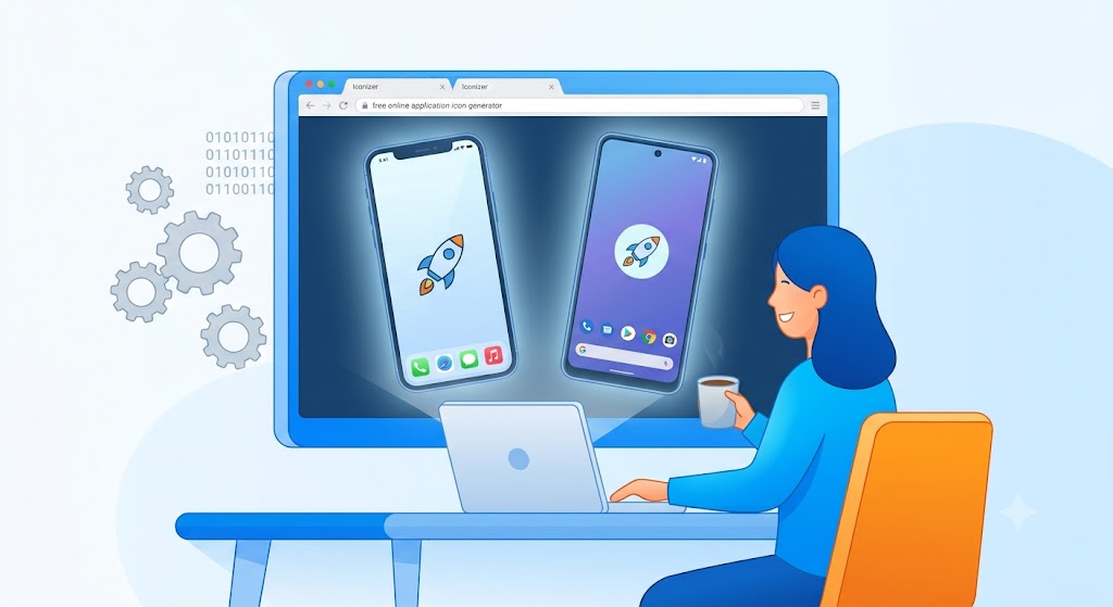
- Includes realistic device previews
The preview feature is especially valuable.
Many icons look fantastic on a design canvas but feel too small, busy, or unbalanced when viewed on an actual home screen.
Seeing the icon inside a device mockup often reveals issues you wouldn’t otherwise notice.
AppIcon.co
AppIcon.co is popular among solo developers and startup founders.
Its biggest advantage is simplicity.
Upload the file, choose your platform, and download a package organized exactly how modern development tools expect it.
No renaming.
No folder sorting.
No manual setup.
Swiftspeed
Swiftspeed focuses on speed and convenience.
If your goal is to move from design to deployment as quickly as possible, it provides one of the fastest workflows available.
For developers shipping multiple projects, those time savings add up quickly.
A Privacy Benefit Many People Overlook
Some modern icon generators process images directly within your browser.
This means your image often never leaves your device during processing.
For developers working on unreleased products, prototypes, or client projects, that’s an added layer of privacy worth appreciating.
iOS vs Android: What Should You Download?
Before integrating the files into your project, verify that your download package contains the expected assets.
| Platform | Required Output | Primary Resolution | Integration Location |
|---|---|---|---|
| iOS | AppIcon.appiconset + Contents.json | 1024 × 1024 px | Xcode → Assets.xcassets |
| Android | mipmap folders (hdpi–xxxhdpi) | 512 × 512 px Play Store icon | Android Studio → res/ |
If these files are present, you’re usually ready to proceed.
Importing Icons into Xcode
For iOS projects:
- Open Xcode.
- Navigate to Assets.xcassets.
- Select AppIcon.
- Drag the generated AppIcon.appiconset into the asset catalog.
- Build the project.
Xcode automatically maps the icon sizes to their appropriate targets.
Importing Icons into Android Studio
For Android projects:
- Open Android Studio.
- Navigate to:
app/src/main/res
- Locate existing mipmap folders.
- Replace them with the generated folders.
- Rebuild the project.
Android Studio will automatically use the appropriate icon based on screen density.
Common Mistakes That Cause Problems Later
Starting With a Small Image
Upscaling a low-resolution image rarely looks good.
Always start with at least:
1024 × 1024 pixels
Larger is fine.
Smaller is not.
Adding Too Much Text
A common beginner mistake is placing an entire app name inside the icon.
Remember where icons are displayed.
Users often see them at extremely small sizes.
Use:
- Initials
- Symbols
- Logos
Avoid full words whenever possible.
Ignoring Different Backgrounds
Your icon won’t always sit on a white background.
Test it against:
- Dark wallpapers
- Light wallpapers
- Colorful backgrounds
Good icons remain recognizable in all environments.
Overcomplicating the Design
Many successful app icons are surprisingly simple.
If your icon requires explanation, it may be trying to communicate too much.
Real-World Example
Imagine you’re launching a productivity app called FocusFlow.
Instead of hiring a designer or learning advanced software:
- Create a 1024 × 1024 canvas in Canva.
- Add a simple lightning-bolt logo.
- Use a clean blue background.
- Export as PNG.
- Upload to EasyAppIcon.
- Download the generated asset package.
- Import it into Xcode and Android Studio.
Within minutes, you’ll have every icon size required for app store submission.
This is essentially the same workflow many independent developers use when launching MVPs and side projects.
Professional Tips for Better-Looking Icons
Focus on One Idea
Strong icons communicate one concept clearly.
Avoid combining multiple symbols or messages.
Use High Contrast
Icons should remain recognizable even when viewed quickly.
Strong contrast improves visibility and memorability.
Limit Your Color Palette
Two or three colors are usually enough.
Too many colors create visual noise.
Test at Small Sizes
Before finalizing, zoom out dramatically.
If the icon still looks recognizable at tiny sizes, you’re likely on the right track.
Frequently Asked Questions
What size should my master app icon be?
Create your source file at 1024 × 1024 pixels.
This meets Apple’s requirements and provides enough resolution for every generated size.
Can I create professional app icons without Photoshop?
Absolutely.
Canva and Adobe Express are capable of producing professional-quality icons for most projects.
Do I need adaptive icons for Android?
No.
Standard icons work perfectly well.
Adaptive icons simply provide additional flexibility and visual consistency across devices.
Can app icons have transparent backgrounds?
For iOS, a fully opaque design is recommended.
For Android, transparency may be used depending on the icon structure and implementation.
Are free icon generators reliable?
Many are widely used by developers and startups.
Always review the site’s privacy policy if you’re working with confidential assets.
Final Takeaway
Creating app icons for iOS and Android is much easier than it was a few years ago.
You don’t need Photoshop.
You don’t need Figma.
You don’t need to manually export dozens of files.
A simple workflow works for most projects:
- Design a 1024 × 1024 master icon in Canva or Adobe Express.
- Keep important elements centered.
- Use a solid, opaque design for iOS.
- Consider adaptive layers for Android.
- Generate all required assets with EasyAppIcon, AppIcon.co, or Swiftspeed.
- Import the generated files into your development environment.
Spend a little extra time on the icon. It’s often the first thing potential users notice—and one of the few branding elements they’ll see every day after installing your app.
check here for design creation How to Update Node.js to the Latest Stable Version for React Native (Using NVM) – knowabteverything
Top 50 React Native Interview Questions & Answers (2026 Edition Part 1) – knowabteverything
Why Is My FlatList Not Updating When State Changes? 4 Fast Solutions – knowabteverything
The Ultimate React Native Beginner Roadmap (2026 Edition) – knowabteverything
Canva India: Visual Suite for Everyone
About Amish
Hi, I’m Amish, and developer.
I write practical React Native, Node.js, MongoDB, and Supabase tutorials based on real projects and testing.